Werner Ulrich's Home Page: Ulrich's Bimonthly
Formerly "Picture of the Month"
January-February 2010

Pensive Professional's Poem for the New Year
Short are the years, long is the art
The
year's turning once again,
has been so busy, gone so fast!
Time
for a break and fresh start,
taking stock of
what will last
and
what is past;
for listening to my heart:
About things to value and maintain,
things to be changed or forgotten!
A moment for being open, not blind,
to
what's been rotten
and what
may burgeon;
for being more clear in my mind:
About
what is futile and vain
and what in the end matters!
What has
value and holds true
beyond
all chatters
and empty clatters;
so that improvement may accrue.
W. Ulrich, 1 Jan 2010
|
|
For a hyperlinked overview of all issues
of "Ulrich's Bimonthly" and the previous "Picture of the
Month" series,
see the site map
Winter photography It's not my favorite season – too cold for sitting in the garden chair – but my more photographic self likes it, despite all the freezing: winter. It's those gorgeous white winter landscapes and skies which warm my heart, especially since I have become a cloudspotter-photographer. To be sure, every season is cloudspotting season; but here in the northern hemisphere, January and February certainly are among a cloudspotter's very best months.
One need not be a cloudspotter though to discover that winter photography has its special charms. Winter scenes – whether dominated by fog and rain or by snow and sun – challenge us to pay attention to nuances of light and shade; to appreciate a scene's essentials; to discover the attraction of photographic minimalism. More than any other season, winter photography invites us to try and see things with the eyes of a black-and-white photographer of old, as it were. Winter photography makes us realize that the exaggerated colors and contrasts produced by most consumer cameras, and actually demanded by many users of digital cameras, are probably not the best way to appreciate digital photography. Fortunately, digital photography allows us to control almost all parameters of our pictures. Winter is the season when it is most helpful to benefit of this major advantage of digital photography.
The aim is not to achieve artificial effects but rather, to do justice to the characteristics of winter, that is, to capture its magic. With this aim in mind, I now routinely change the standard settings of my cameras to lower contrast and to "natural" or "neutral" (rather than "vivid") colors, often (but not always) combined with lower saturation. In addition, I routinely underexpose my pictures – with exceptions to be mentioned in a moment – by selecting a standard exposure bias of -0.3 or -0.6, so as to prevent blown-out highlights. I also tend to apply less noise reduction in combination with reduced in-camera sharpening of pictures, to avoid the loss of fine detail (texture) that goes along with the usual oversharpening and strong noise reduction of many standard camera settings. Taken together, these adjustments yield better resolution and texture, produce more natural colors and nuances of light and shade, and improve the camera's dynamic range, that is, its capability of handling stark contrasts; what is more, they improve the basis for post-processing.
If in comparison to conventional analog photography there is one major drawback of digital photography that has not been fully overcome as yet, it is indeed the limited dynamic range of current light sensors – their insufficient ability to simultaneously capture both dark shadows and highlights in a scene. As the trend is to pack an ever increasing amount of pixels on small sensors, the individual pixel becomes smaller and thus – under given conditions of light intensity, sensor sensitivity, exposure time and lens aperture – will collect less light, that is, record fewer electric charges triggered by photons. Since each pixel has a minimum and maximum charge that it can record and process (i.e., convert into a well-defined signal), low levels of electric charge (dark areas of the picture) may be lost and conversely, high levels (highlights) risk "overflowing" the pixel's capacity. The resulting dilemma is known to any digital photographer: we need to find a satisfactory compromise between the two risks of lost detail (tonal range) in the shades on the one hand and blown-out or clipped highlights on the other. Furthermore, smaller pixels also mean that if the sensor is to have the same sensitivity to light as before, that is, allow for the same exposure times (shutter speeds), each pixel's signal needs to be amplified (reinforced) more; but unfortunately this amplifies not only the desired signal but undesired background noise as well. This creates a difficulty both for the camera's processor, which converts the analog signals (grayscale values and color coding) of the sensor's pixels into a digital picture, and for the photographer who may later wish to brighten underexposed parts of the picture by manual post-processing. Thus it comes that in digital photography, "highlight clipping" and "shadow noise" are two main sources of poor picture quality, particularly in light conditions characterized by stark contrast and/or low light. Such conditions often obtain in winter, and that is a basic reason why winter photography poses some special challenges.
A second reason has to do with the aesthetic and artistic side of winter photography. The only way we learn to master the artistic side is probably by looking carefully at winter scenes and pictures, trying to consciously experience and see their magic; there is no way we can reduce that quality of experience to technical rules and tricks. Still, understanding some basic pieces of advice may help us in learning to "see." I would therefore like to try and offer some basic hints with regard to both issues, the technical and the aesthetic particularities of winter photography. I propose to do this in a personal manner, based on my limited experience rather than any particular technical expertise or even artistic presumption. In addition, I will offer a few pictures for illustrative purposes. Since satisfactory winter pictures usually result from a combination of (several) technical with (several) aesthetic ideas, it is hardly possible to match the photographs and the hints they illustrate 1:1. Even so, I hope it will rather easy for the reader to recognize in these pictures my technical and artistic hints. The idea is that after reading them, you will indeed "see" in the pictures aspects that you might otherwise have missed, and thus will get an immediate sense (and control) of what you have learned from my account of the technical and aesthetic particularities of winter photography.
Some basic hints: "technical" It is often assumed – and what I have just explained seems to suggest – that winter photography is particularly difficult. However, this is not necessarily so. Winter photography is simply different from what most of us are used to, and to some extent also from what the standard settings of digital cameras (especially compact cameras) are intended for. Due to the different nature of the subjects we want to capture in winter, along with the different conditions of light, we need to pay attention to a few special rules, that is all. For instance, I have mentioned that as a general rule I find it helpful to underexpose most of my pictures by about two thirds of an f-stop, so as to avoid blown-out highlights (e.g., blue skies rendered white) and to gain a better basis for post-processing (it's easier to "lift" dark shades, if they disturb at all, than to recover blown-out highlights). For winter pictures, the contrary advice is recommended. As the camera does not know that snow is white and should be depicted as such, it tends to see the abundance of white as a risk (or result) of overexposure and accordingly will tend to underexpose. This is why winter pictures, even when there is a lot of brilliant snow, so often turn out disappointingly gray and dark rather than white and radiant. Hence, while for other seasons experience suggests to me the first and most basic rule of digital photography is to avoid overexposure, the first rule of winter photography reads:
«If it's bright, add light.»
This rule applies particularly when you photograph winter scenes in bright but diffuse light, so that the snow does not show much texture and detail. The more texture and contrast appears in the picture, the less you need to overexpose. If you are not sure, take two or three pictures with varying exposure bias (so-called exposure bracketing), and control the result not only optically (camera monitors provide only an approximate impression of possible over- or underexposure) but also by following a second basic advice:
«The histogram is your friend.»
That is, routinely check the histogram of your pictures – a diagram showing the frequency of shades, midtones, and highlights in the picture – and make sure it is fairly well centered rather than being extremely one-sided; even more important, make sure it is not overshooting either on the left (dark) or right (light) side. Most digital cameras nowadays offer the option of displaying a histogram, and it is good advice to use it systematically. The following picture shows a histogram standing for a well-balanced distribution of shades, midtones, and highlights:

Basically, a promising histogram shows a distribution of dark, middle, and light tones that avoids peaks at either the left or the right end of the horizontal axis. We can understand the horizontal axis as representing the dynamic range of a camera sensor, with the darkest tone it can capture on the left and the brightest on the right. Standard sensors today can distinguish at least 256 tone levels (grayscale values) for each of the three basic color filters used to compose the picture. Such a sensor can thus distinguish a total of 256 x 256 x 256 = 16.7 million colors, but only 256 tone levels are needed to depict a histogram, either for each of the three basic colors or for the total resulting luminance of a picture (advanced cameras will display all four histograms).
We can then say that in principle, a picture captures a maximum of information about the nuances of light and shade as well as colors in the photographed scene if each of its four histograms (or at least the total luminance histogram, also called "gray luminosity" histogram) stretches across the sensor's entire dynamic range (the entire horizontal axis) and moreover present a somewhat balanced frequency distribution of the 256 tone values. It should be clear though that what is "balanced" depends very much on the picture's content, so that there is actually no such thing as an ideal histogram, only one that is ideally suited to what the picture is to express. Very often, my histograms look much less symmetric and regular than in the model above, yet their distribution of shades, midtones, and highlights seems right for the picture I had in mind. This hold true particularly for winter pictures with snow, as the following example shows:
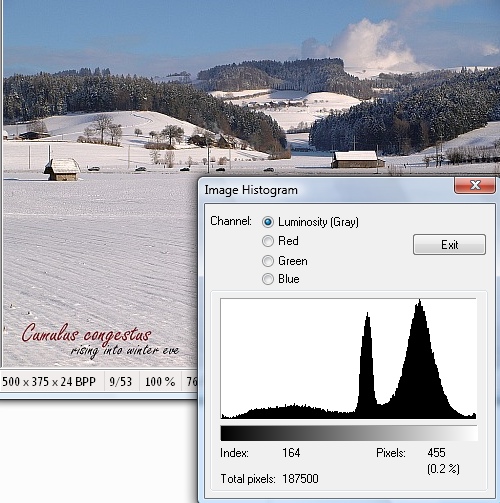
This is the histogram of one of the winter pictures you will find below. Its emphasis is very clearly on light tones, yet the picture looks exactly the way I wanted it to be, emphasizing the brilliance of an early winter evening without showing too much contrast. This histogram is very acceptable for a winter picture, in that there is virtually no highlight clipping and nuances of middle and dark tones stretch across the entire axis to the left end with no shadow clipping either.
In the above example, I hardly needed to apply any correction to the picture as it came out of the camera. With other pictures that you will find below, this was different. The "snow peaks" in their histograms were more extreme or there were other reasons why the pictures did not convey the winter ambience as I had experienced it; in most cases there was too much contrast, and/or lacking nuances of middle and darker tones, and/or the snow and overall ambience were to grayish. In such cases a third recommendation sums up much of what I have learned from my personal attempts at digital winter photography:
«Flatten your tonal curve!»
In other words, control your contrasts, so that the resulting histogram does not show extreme inequalities of the frequencies of light, middle, and dark tones. The idea is to tone down the highlight peaks while at the same time brightening the dark and middle tones, to achieve a friendlier, more balanced overall picture. In a typical winter picture, the "snow peaks" will then be flatter and at the same time move somewhat to the right. There are basically three ways to achieve this: (1) by changing (where possible) your camera settings; (2) by post-processing your pictures on a computer; and (3), most recommendable, by a combination of (1) and (2).
Re: (1). As mentioned before, set your camera's contrast settings lower than standard. In addition or alternatively, if your camera offers a manual or automatic shadow adjustment feature, activate it as a standard setting for winter scenery. For example, in Nikon cameras this setting (both manual and automatic) is called "active D-Lighting," in Canon cameras "Highlight Tone Priority" (manual) or "i-Contrast" (automatic), and in Olympus cameras "High Key" (manual) or "Auto Gradation" (automatic). Advanced reflex cameras today even offer you a chance to design your own preferred standard tonal curve on the computer and then upload it to the camera.
Re: (2) In post-processing, the tool that I find most helpful is a so-called gamma correction. This is a nonlinear operation that changes the tonal curve of your picture so that extremely dark or light tones are adjusted more strongly than middle tones. Thus when you increase the gamma value (γ > 1), dark tones (e.g., shaded areas) are lifted more than other tones; as a result, the tonal curve becomes flatter and is situated higher, so that the picture looks brighter and stark contrasts are reduced without causing highlight clipping. Conversely, if you decrease the gamma value (γ < 1), the picture will look darker and offer more contrast. To achieve a balanced overall result, it will often be good advice to adapt the overall brightness and color saturation to the changed tonal curve; as a rule of thumb, increased saturation goes favorably with increased gamma, decreased saturation with decreased gamma. If you are not equipped to adjust the gamma value of your pictures, individual adjustments of the brightness, contrast, and color saturation levels of your picture can achieve the same result.
Re: (3). My own experience is that a combination of the two previous strategies works best. My reflex camera (unlike my recently acquired compact camera) does not yet offer automatic shadow adjustment technology, so what I do is simply to take most pictures with a basic exposure compensation of minus two thirds of an f-stop (aperture setting) or, where the "add light" rule applies, I set the exposure compensation back to zero and thus still "underexpose" in relation to what the available light conditions would basically require. In post-processing I then routinely "add light" by experimentally finding a proper adjustment of the gamma value, along with brightness and color saturation. The trick of this combination is that the primary exposure compensation – as compared to standard exposure or to the "add light" rule, respectively – creates optimal conditions for later gamma corrections, particularly if the camera settings also include the other adjustments described at the outset (adjusted levels of color saturation, sharpening, and noise reduction).
«Shadow adjustment technology: yes but...»
I suspect the combined strategy just explained for handling the limited dynamic range of digital cameras amounts to something like a manual "simulation" of the core idea of what only recently has become known under the name of shadow adjustment technology. I would thus have intuitively used it without knowing it exists, simply based on experience. In addition, I imagine good shadow adjustment technology will ultimately go beyond what we can do by adjusting camera settings and post-processing, for example (I imagine) by combining gamma correction with some form of dynamic range stretching, that is, making sure that the entire range of 256 tone values that the sensor can identify is used to capture the nuances of light and shade available in the real world.
To the extent this is so, it raises the question whether the new technology renders the above recommendations, and the personal experience on which they rest, redundant. Perhaps it does, to some extent. Automatic in-camera optimization of the tonal curve is certainly an essential technical progress. The question is whether it can ever yield the same quality of results as post-processing can, guided by the photographer's individual creative skills and sense of aesthetics (perhaps it can, if camera settings allow individual adjustments of the technology). Another issue is whether camera producers might not be tempted to quickly exploit the new technology to pack even more pixels on their sensors. Regarding both questions, it is too early to tell, as the technology is still in its infancy. Meanwhile a combination of in-camera processing and post-processing may remain the best option, certainly for handling demanding conditions such as winter photography presents them. I suspect this will remain so for some time, even with cameras that do have automatic shadow technology implemented. To judge from my "always with me" pocket camera which is equipped with the technology, it appears to be more successful in brightening dark picture areas than in avoiding blown-out highlights. Accordingly my results are still better when I combine automatic shadow adjustment with simultaneous exposure compensation and individual post-processing.
Some more hints: "artistic" So much for the more technical side of winter photography. A basic understanding of the issues we have discussed is never more useful than in winter photography. Even so, winter photography is more – far more – than a technical challenge. Its main interest for me lies with the aesthetic, read: artistic potential of digital photography. More than any other season, winter photography trains the eye to observe what makes a landscape or scene interesting, beautiful, or in any way special. In a sense, it leads us back to the art of expressing things in black and white pictures, that is, in shades of gray. So, if we now turn to a few aesthetic (or artistic) rather than technical hints, perhaps a basic advice is this. Whether in conditions of brilliant sun light and stark contrasts or of poor light and low contrast, it is hardly ever a bad idea in winter photography to
«Imagine you are taking a black-and-white photograph!»
That is, ask yourself whether the picture you are about to take would be of interest if you had only black-and-white negative film in your camera. Black-and-white pictures come to life through the play of light and shade, and express ambience through nuances of gray. Accordingly, even though you will usually shoot in color, look for the way nuances of light, of gray tones and subtle colors, along perhaps with a few stark contrasts, shape a winter scenery's ambience. Try to capture the fine structures of a winter landscape, along with the texture of snow. Worry more about conveying to the viewer all the nuances of light and shade, and consequently about avoiding blown-out highlights and overly stark contrasts, than about achieving brilliant colors. Whereas proper color rendition is essential for capturing spring flowers, or blue summer skies, or the saturated colors of an autumn forest, our priorities in winter photography must nolens volens change. Here, color comes second whereas capturing the play of light and shade, of flat and strong contrasts, of fine detail and generous overall structures is primary.
A good idea in dealing with these issues is this:
«Simple is beautiful!»
The beauty of a winter scene has often much do to with its simplicity, its generosity, the calm it radiates. So let us make a virtue of necessity and try to capture the attraction of such simplicity. Focus on what is essential, say, the lines of some hills or mountains in the background; the silhouettes of some people or trees in the foreground or middle ground; the play of light and shade; or whatever helps to capture the ambience of a winter scenery.
This need not mean that winter pictures have to be boring. Hence, whenever winter landscapes – at least at first sight – offer little natural guidance to the human eye, it is a good idea to
«Watch out for fine structures and patterns!»
so as to make them interesting and guide the viewer's eye, perhaps even create some interesting tension in the picture. Most winter scenes do in fact offer some attractive fine structures, if only we care to see them. For example, when the ground is covered with little snow or is merely frozen, interesting patterns often arise from the combination of snow or ice and the structure and colors of the ground beneath. The wind can create wave- or dune-like structures in the snow similarly to those in a (sandy) desert. Sidelight can make the snow's texture come out. Silhouettes of some lonely houses or trees in a winter landscape create depth and offer guidance to the viewer's eye. So can the wintry roads and trails, ski tracks, footsteps or other structures introduced by people, traces in the snow. And so on. What holds true for all good photography is particularly important for winter photography: it begins with seeing – and enjoying! – the quiet beauty of winter scenes, rather than with technical skills and expensive equipment.
«Try backlit photography!»
Of special interest are backlit photographs, that is, pictures taken against the light. To avoid that the sun outshines everything else in the picture or even damages your sensor, try to "hide" it behind a tree or any other object available (a road sign, the shade of a roof or umbrella, etc.).
A last hint – how could it be else – must be:
«Clouds add clout!»
Winter skies are often an essential part of winter scenes, as they offer such an interesting contrast to the relatively unstructured and calm nature of winter landscapes. Even if you are not an dedicated cloud spotter, why not try to capture the way clouds seem to "play" with winter landscapes, as a way to compensate for the frequent lack of structure, color, and contrast in winter landscapes?
Below I offer some photographs that try to illustrate part of the hints I have just formulated. They were not taken to this end in the first place. As always, in winter photography no less than in my other photographic attempts, I follow my spontaneous sense of what is interesting and beautiful in a landscape or scene, rather than any rules. Winter photography is about expressing the character of winter more than anything else. It is the scenery out there which must have the say, not any rules we impose on it. The point of the preceding account is certainly not that you ought to learn by heart any rules; its only purpose is to help you appreciate winter pictures with a better eye for their essential characteristics. Rather than binding us to rules, photography should free us to see.
Some illustrative winter pictures
(Roll
your mouse over each picture to get a short comment;
click
on pictures to enlarge them)
)
)
)
)
)
)
)
)
)
)
|
January 2010
|
|---|
|
February 2010
|
|---|
Picture data (bimonthly picture below) Digital photograph taken on 25 February 2009, shortly after 4:15 p.m., in aperture priority mode, ISO 100, aperture f/7.1, exposure time 1/1600, exposure bias -0.30, focal length 24 mm (equivalent to 48 mm with a conventional 35 mm camera). Original resolution 3872 x 2592 pixels; current resolution 700 x 525 pixels, compressed to 75 KB. The larger size, which shows when you click on the basic picture, has 1024 x 768 pixels and is compressed to 142 KB.
|
January-February, 2010 |
|
|
|
Traces in the snow |
)
„Photography should free us to see.”
(From this account of winter photography)
Notepad for capturing personal thoughts »
|
Personal notes:
Write
down your thoughts before
you forget them! |
|
Last
updated 4 Jan 2010 (first published 2 Jan
2010)
http://wulrich.com/bimonthly_january2010.html